Autonomous DEM
Using the Access Experience UI
Table of Contents
Using the Access Experience UI
Learn how to navigate the Access Experience user interface.
| Where Can I Use This? | What Do I Need? |
|---|---|
|
|
The Access Experience User Interface (UI) displays
detailed information about performance issues that may be impacting your applications.
It also offers recommendations for resolving the underlying performance issues.
You can open this application window by
clicking on an associated notification or directly to see the status
of your device, and WiFi or internet connection.
When you open the Access Experience UI by clicking on
the notification, it displays information that is specific to your notification. When
you open it directly, it will display the current state of your Device, WiFi, and
Internet connectivity.

The notifications get categorized by their source.
Device
- CPU usage notifications
- Memory usage notifications
WiFi
- Poor WiFi quality
- Disconnected WiFi
- WiFi Network Switching
Internet
- Disconnected internet
Click Device, WiFi,
or Internet in the left panel to display
the current performance of that segment.
Clicking Learn More will open a time series
chart with historical information about the performance of the selected
segment for the last 3 hours.
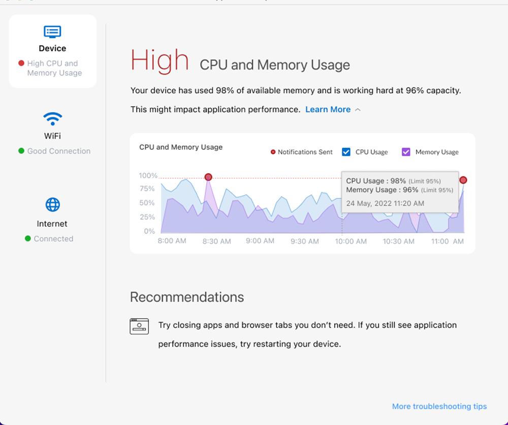
The time series chart under Learn More shows
the following:
- The slider bar placed at the right end of the chart is set by default to the current time. To move the slider bar, click on the timestamp you want to examine. Depending on where you mouse over and click in the chart, you can view the status and recommendation that was indicated at that specific time. Click anywhere within the Learn More section to bring the sider to the current status (at the end of the chart).
- The trend lines in the chart may display one or more red dots, which indicate that a notification was sent to you at that moment in time where the dot appears.
- For Device notifications, you can filter the CPU and memory data by selecting only the check box(es) for the data that you wish to display.
- You can visually identify the areas where there is a problem. The Device, WiFi and Internet buttons in the left pane include a colored dot to indicate the health of each segment. A green dot indicates that the health of the segment is good or excellent. A yellow dot indicates that the quality of WiFi signal strength is fair. A red dot include a colored dot to indicate the health of each segment.