Strata Cloud Manager
Application Experience Insights: Experience Score Trends
Table of Contents
Application Experience Insights: Experience Score Trends
Get a sense of the distribution of application performance across all monitored apps
and users, view the network-wide score trend, and pinpoint when the digital experience began
to degrade in this widget.
| Where Can I Use This? | What Do I Need? |
|---|---|
|
|
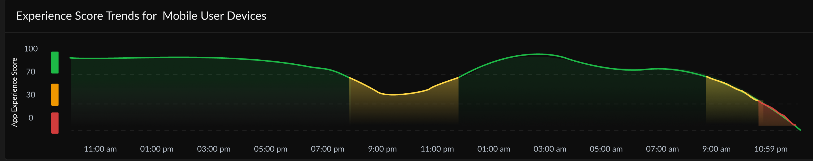
This widget displays a time series graph of average Mobile Users experience of all Mobile
Users. The experience score is calculated and displayed at set intervals during the
selected time range. The y-axis is color coded based on score range to show you the
quality of your experience score (Red = Poor, Yellow = Fair, and Green = Good). Hover
your mouse cursor over the trend line to see the experience score at the time where your
cursor is placed.