Next-Generation Firewall
Use the App Scope Reports
Table of Contents
Expand All
|
Collapse All
Next-Generation Firewall Docs
-
-
-
-
-
-
-
- PAN-OS 12.1
- PAN-OS 11.2
- PAN-OS 11.1
- PAN-OS 11.0 (EoL)
- PAN-OS 10.2
- PAN-OS 10.1
- PAN-OS 10.0 (EoL)
- PAN-OS 9.1 (EoL)
- PAN-OS 9.0 (EoL)
- PAN-OS 8.1 (EoL)
-
- PAN-OS 12.1
- PAN-OS 11.2
- PAN-OS 11.1
- PAN-OS 10.2
- PAN-OS 10.1
Use the App Scope Reports
| Where Can I Use This? | What Do I Need? |
|---|---|
|
|
The App Scope reports provide visibility and analysis tools to help pinpoint problematic
behavior, helping you understand changes in application usage and user activity, users
and applications that take up most of the network bandwidth, and identify network
threats.
With the App Scope reports, you can quickly see if any behavior is unusual or unexpected.
Each report provides a dynamic, user-customizable window into the network; hovering the
mouse over and clicking either the lines or bars on the charts opens detailed
information about the specific application, application category, user, or source on the
ACC. The App Scope charts on MonitorApp Scope give you the ability to:
- Toggle the attributes in the legend to only view chart details that you want to review. The ability to include or exclude data from the chart allows you to change the scale and review details more closely.
- Click into an attribute in a bar chart and drill down to the related sessions in the ACC. Click into an Application name, Application Category, Threat Name, Threat Category, Source IP address or Destination IP address on any bar chart to filter on the attribute and view the related sessions in the ACC.
- Export a chart or map to PDF or as an image. For portability and offline viewing, you can Export charts and maps as PDFs or PNG images.
The following App Scope reports are available:
- Summary Report
- Change Monitor Report
- Threat Monitor Report
- Threat Map Report
- Network Monitor Report
- Traffic Map Report
Summary Report
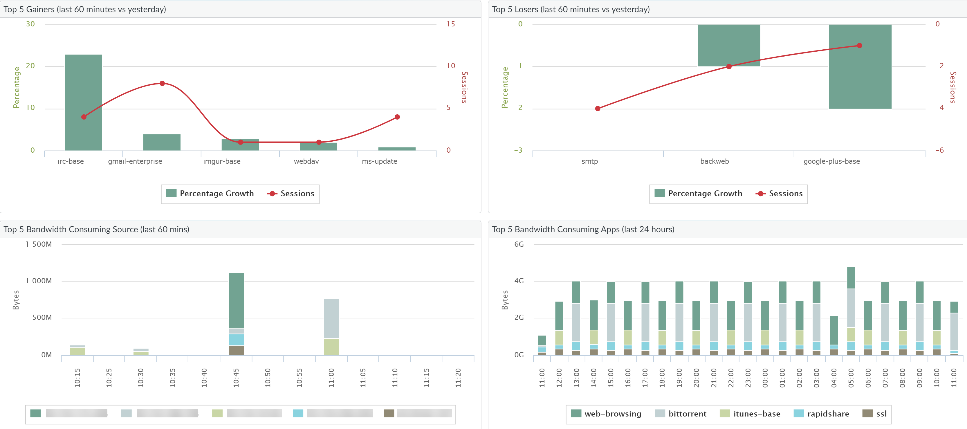
The App Scope Summary report (MonitorApp ScopeSummary)
displays charts for the top five gainers, losers, and bandwidth
consuming applications, application categories, users, and sources.

Change Monitor Report
The App Scope Change Monitor report (MonitorApp ScopeChange Monitor) displays changes
over a specified time period. For example, the following chart displays
the top applications that gained in use over the last hour as compared
with the last 24-hour period. The top applications are determined
by session count and sorted by percent.

The Change Monitor Report contains the following buttons and
options.
Button | Description |
|---|---|
Top 10 | Determines the number of records with the
highest measurement included in the chart. |
Application | Determines the type of item reported: Application, Application
Category, Source, or Destination. |
Gainers | Displays measurements of items that have
increased over the measured period. |
Losers | Displays measurements of items that have
decreased over the measured period. |
New | Displays measurements of items that were
added over the measured period. |
Dropped | Displays measurements of items that were
discontinued over the measured period. |
Filter | Applies a filter to display only the selected
item. None displays all entries. |
Determines whether to display session or
byte information. | |
Sort | Determines whether to sort entries by percentage
or raw growth. |
Export | Exports the graph as a .png image or as
a PDF. |
Compare | Specifies the period over which the change measurements
are taken. |
Threat Monitor Report
The App Scope Threat Monitor report (MonitorApp ScopeThreat Monitor) displays a
count of the top threats over the selected time period. For example,
the following figure shows the top 10 threat types over the last
6 hours.

Each threat type is color-coded as indicated in the legend below
the chart. The Threat Monitor report contains the following buttons
and options.
Button | Description |
|---|---|
Top 10 | Determines the number of records with the
highest measurement included in the chart. |
Threats | Determines the type of item measured: Threat,
Threat Category, Source, or Destination. |
Filter | Applies a filter to display only the selected
type of items. |

| Determines whether the information is presented
in a stacked column chart or a stacked area chart. |
Export | Exports the graph as a .png image or as
a PDF. |
Specifies the period over which the measurements
are taken. |
Threat Map Report
The App Scope Threat Map report (MonitorApp ScopeThreat Map)
shows a geographical view of threats, including severity. Each threat
type is color-coded as indicated in the legend below the chart.
The firewall uses geolocation for creating threat maps. The firewall
is placed at the bottom of the threat map screen, if you have not
specified the geolocation coordinates (DeviceSetupManagement, General
Settings section) on the firewall.

The Threat Map report contains the following buttons and options.
Button | Description |
|---|---|
Top 10 | Determines the number of records with the
highest measurement included in the chart. |
Incoming threats | Displays incoming threats. |
Outdoing threats | Displays outgoing threats. |
Filer | Applies a filter to display only the selected
type of items. |
Zoom In and Zoom Out | Zoom in and zoom out of the map. |
Export | Exports the graph as a .png image or as
a PDF. |
Indicates the period over which the measurements
are taken. |
Network Monitor Report
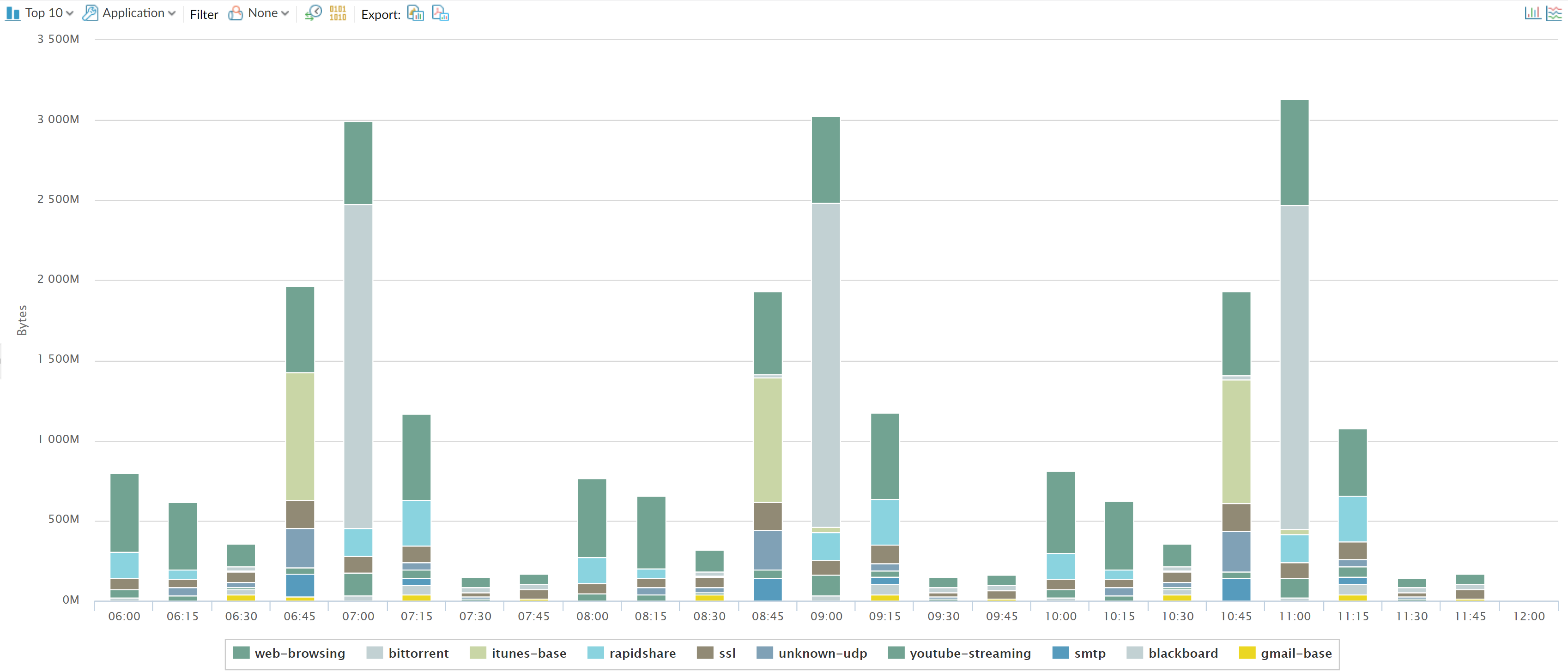
The App Scope Network Monitor report (MonitorApp ScopeNetwork Monitor) displays the
bandwidth dedicated to different network functions over the specified
period of time. Each network function is color-coded as indicated
in the legend below the chart. For example, the image below shows
application bandwidth for the past 7 days based on session information.

The Network Monitor report contains the following buttons and
options.
Button | Description |
|---|---|
Top 10 | Determines the number of records with the
highest measurement included in the chart. |
Application | Determines the type of item reported: Application, Application
Category, Source, or Destination. |
Filter | Applies a filter to display only the selected
item. None displays all entries. |
Determines whether to display session or
byte information. | |
Export | Exports the graph as a .png image or as
a PDF. |

| Determines whether the information is presented
in a stacked column chart or a stacked area chart. |
Indicates the period over which the change measurements
are taken. |
Traffic Map Report
The App Scope Traffic Map (MonitorApp ScopeTraffic Map)
report shows a geographical view of traffic flows according to sessions
or flows.
The firewall uses geolocation for creating traffic maps. The
firewall is placed at the bottom of the traffic map screen, if you
have not specified the geolocation coordinates (DeviceSetupManagement, General
Settings section) on the firewall.

Each traffic type is color-coded as indicated in the legend below
the chart. The Traffic Map report contains the following buttons
and options.
Buttons | Description |
|---|---|
Top 10 | Determines the number of records with the
highest measurement included in the chart. |
Incoming threats | Displays incoming threats. |
Outgoing threats | Displays outgoing threats. |
Determines whether to display session or
byte information. | |
Zoom In and Zoom Out | Zoom in and zoom out of the map. |
Export | Exports the graph as a .png image or as
a PDF. |
Indicates the period over which the change measurements
are taken. |


