Strata Cloud Manager
SASE Health Insights: Current Mobile Users - Map View
Table of Contents
SASE Health Insights: Current Mobile Users - Map View
View the health metrics of your Mobile users across all locations in this
dashboard.
| Where Can I Use This? | What Do I Need? |
|---|---|
|
→ The features and capabilities available to you in Strata Cloud Manager depend on which license(s) you are
using.
|
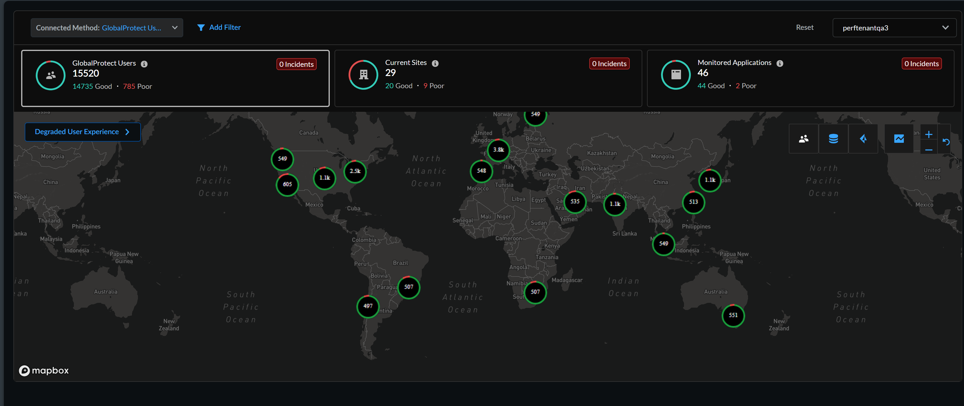
The Current Mobile Users tab in the SASE
Health dashboard shows you an overview of the breakdown of Mobile User
experience across all locations. The number in the circles correspond to the number of
Mobile Users who are currently connected to Prisma Access using GlobalProtect. A dot
represents a single Mobile User. A green circle or dot indicates Good user experience
score. Likewise, a red one indicates a degraded experience score. Degraded experience
scores comprise of Fair and Poor scores combined. The line chart to the right of
Current Mobile Users shows you a trend of the average
experience scores for all Mobile Users during the selected Time
Range.
Click the number (representing the potentially degraded-experience user count) next to the
Potential Degraded Experience or
Incidents to see the details of the degraded user experience
in a pane that opens on the left.