Autonomous DEM
View Application Experience Across Your Organization
Table of Contents
Expand All
|
Collapse All
Autonomous DEM Docs
-
- AI-Powered ADEM
- Autonomous DEM for China
-
-
- AI-Powered ADEM
- Access Experience Agent 5.1
- Access Experience Agent 5.3
- Access Experience Agent 5.4
View Application Experience Across Your Organization
Use the application experience dashboard to view the quality of your users' digital
experience across your organization.
| Where Can I Use This? | What Do I Need? |
|---|---|
|
|
The Application Experience dashboard gives you a bird’s eye view of
digital experience across Your Organization and enables you to view and manage
the Application Domains your users are visiting. You can use this dashboard to
detect potential experience issues at a glance and then drill down into a specific
element to begin your investigation toward remediation.
From Application Experience, you can:
- Investigate a specific application—Select an application name to open Application Details. Do this when you notice performance issues with an application to identify the root cause and any possible remediation measures.
- Investigate a specific user—Select a user name to view User Details. You can do this when you notice a user is having degraded experience and want to determine whether the issue impacts the user alone or is a sign of broader performance issues.
- Configure synthetic monitoring—Create and manage Application Tests and Application Suites to observe end-to-end user experience from device to application.
- Your Organization
- Mobile User Experience
- Browser Activity (Requires Browser-Based Real User Monitoring (RUM))
- Top 5 Application Domains with Degraded Experience
- Root Cause of Degraded Application Experience
- Segment-Wise User Impact
- Users Impacted
- Experience Score Trend for Apps
- Global Distribution of Application Experience Scores for Mobile User Devices
- Real User Performance Metrics (Requires Browser-Based Real User Monitoring (RUM))
- Application Domains
Your Organization
This dashboard contains insights to help you understand application experience across
your organization and learn how to begin remediating issues. From this dashboard,
you can get more details about an application's performance or a user's experience
by selecting an application or user name.
Mobile User Experience
Shows you metrics about the experience of all mobile users across all
domains. You can use this information to assess the overall experience of your
connected users.
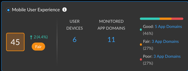
| Mobile User Experience Score |
The overall application experience score
of your users. Use this score to determine whether you need
to take action to improve user experience.
Next to the overall score is the change in the score over the
time range you selected.
To calculate the change over time, ADEM
compares the score at the beginning of the current time
period to the beginning of the previous time period. For
example, if you selected Past 24 Hours, the change is
the difference between the score at the beginning of the
current 24 hours and the score at the beginning of the
previous 24 hours.
|
| User Devices | Number of unique monitored devices. A monitored device is one that has a synthetic app test assigned to it or has accessed the internet with the ADEM Browser Plugin installed. |
| Monitored App Domains |
Number of application domains for which you’ve created
synthetic tests or that users are accessing from a browser
with the ADEM Browser Plugin installed.
The bar shows the breakdown of domains according to experience score.
You can see the exact number of app domains in each
experience score ranking. Select the number of app domains
for a filtered view of the application domain list.
|
Browser Activity (Requires Browser-Based Real User Monitoring (RUM))
Shows information about user browser activity across your
organization.

| Total Time Spent |
The total number of hours that monitored users have been web
browsing and their distribution across experience
scores.
Use this to see what proportion of time users had degraded
application experience. If the percentage of fair or poor is
greater than expected, investigate
the root cause.
|
| Total Application Domains |
Unique domains that monitored users are visiting and their
distribution across experience
scores.
Use this to see what proportion of monitored application
domains showed degraded application performance. Select the
number of fair or poor domains to view
|
| Core Web Vitals | Application performance metrics that Google has defined as critical to user experience. |
Top 5 Application Domains with Degraded Experience
Shows the top 5 domains with the poorest performance in your organization over
the time period selected. The way in which ADEM calculates
each metric depends on the kind of data available: RUM, synthetic metrics, or
both. If both RUM and synthetic metrics are available, then ADEM uses RUM data.

| User Devices Impacted | The number of user devices accessing the domain while the domain showed degraded application experience. |
| Time Impacted | The amount of time that user devices were impacted by degraded application experience. |
Root Cause of Degraded Application Experience
Shows the top causes of degraded application experience across your organization.
The kind of metrics you see will depend on whether you have synthetic tests enabled for app domains
and whether users are accessing applications from a browser that supports RUM.
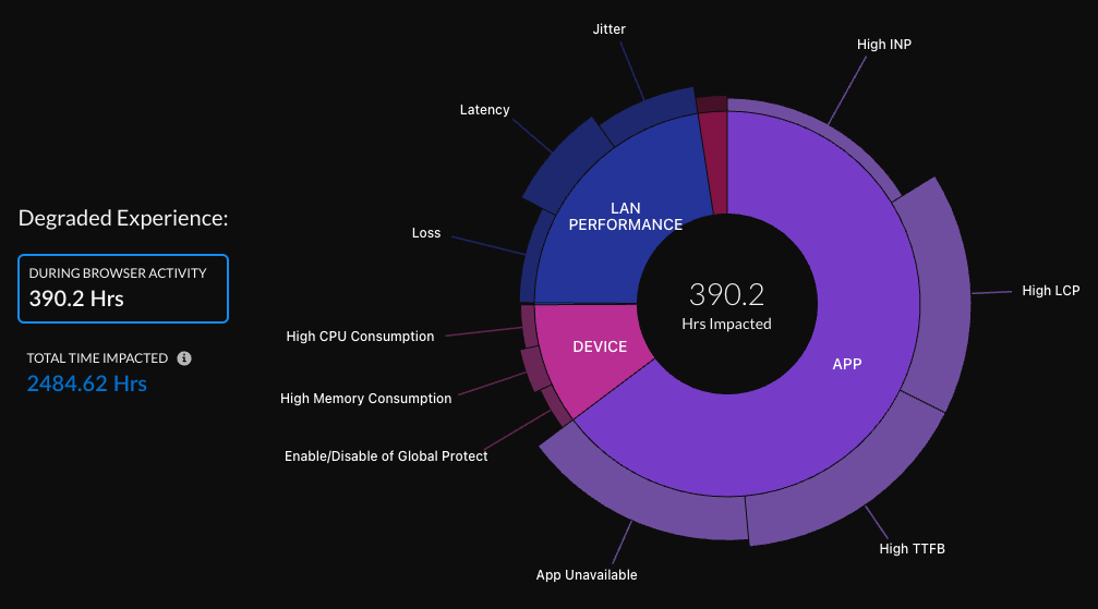
| Degraded Experience |
|
The sunburst chart will look different depending on the monitoring sources you are
using:
- Synthetic monitoring and RUM
![]()
- Synthetic monitoring only
![]()
- RUM onlyYou'll only see the option to Enable Synthetic Tests if synthetic monitoring is supported on user devices.
![]()
How to Read the Sunburst Chart
The sunburst chart helps you visualize segment-wise issues and
their impact on users. Here's how it works:
- Inner and Outer Rings:
- The inner ring represents different service delivery segments.
- The outer ring represents the specific components causing experience issues within each segment.
- Ring Thickness:
- The thickness of each ring shows, proportionally, how much each segment or component contributes to the Total Impacted Time.
- Thicker rings indicate a larger contribution, helping you prioritize remediation efforts based on impact.
- Interactivity:
- You can select a segment or hover over a component to see its impact on key metrics like number of users affected, hours impacted, and application domains.
- Width of Segments:
- The width of each segment is proportional to its share of the Total Time Impacted.
- For example, if the total impacted time is 100 hours, and "Device" components account for 20 hours while "App" components account for 80 hours, the "Device" segment would be much thinner than the "App" segment.
- In cases where both issues (App and Device) occur simultaneously, the segments could be equally wide, even if both are responsible for the same 80 hours.
- Height of Components:
- The height of a component within a segment represents the proportion of impacted time that component contributed.
- For example, if "Device" components caused 10 hours of impacted time, and "High Memory Consumption" caused 2 hours while "High CPU Consumption" caused 1 hour, the "High Memory Consumption" component would be twice as tall as the "High CPU Consumption" component.
- Like segments, components can overlap in their impact, meaning they might have the same height if they contributed equally.
Users Impacted
Shows all users impacted by app degradation for any length of time
during the selected time period.

| User Name | Name of the user who had degraded application experience for any length of time during the selected time period. |
| User Device | The device that the user was on when they had degraded application experience. |
| Time Impacted | The total amount of time that the user had degraded application experience on the device listed during the selected time range. |
| App Domains Impacted |
The number of app domains that showed degraded
application experience during the selected time
range.
Select the number to view the app domains impacted, how
long they were impacted, and their application
experience score.
|
| Potential Root Cause |
Potential root causes for degraded application
experience.
Select the root cause to see any other root causes, the
service delivery segments under which they fall, and
full suggested remediations.
|
| Suggested Remediation |
Remediation steps that you can take for addressing the
root causes of the degraded application experience.
|
Segment-Wise User Impact
Shows the distribution of users impacted at each service delivery segment. The
health of each segment correlates to the score of an underlying metric. The
number of segments displayed depends on the type of data ADEM
is collecting.
If ADEM has no data for a segment, then the segment does not
appear. For example, if you have RUM enabled but no synthetic tests, then you
will see only Device and App.
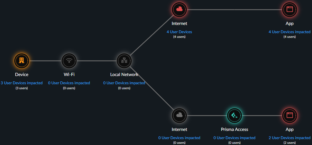
| Device | Uses synthetic test and RUM data. If both are present, RUM takes precedent. |
| Wifi | Uses synthetic test data. |
| Local Network | Uses synthetic test data. |
| Internet | Uses synthetic test data. |
| Prisma Access | Uses synthetic test data. |
| App | Uses synthetic test and RUM data. If both are present, RUM takes precedent. |
| Segment color | The average score across all user devices. |
| Users Impacted | Count of distinct users who had degraded application experience during the selected time period. |
| Devices Impacted | Count of distinct devices that had degraded application experience during the selected time period. |
| Time Impacted | The amount of time that a user had degraded application experience during the selected time period. |
Experience Score Trend for Apps
The average application experience score across all applications. Uses combined
RUM and synthetic test data if both are available.

Global Distribution of Application Experience Scores for Mobile User Devices
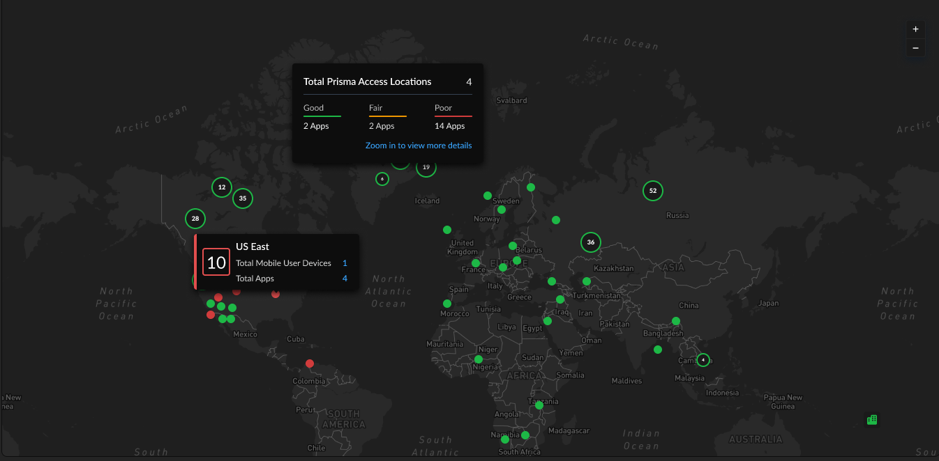
The global distribution of users based on the user location and Prisma Access location. You can group by either User Locations or
Prisma Access Locations. The chart displays User Locations by
country and Prisma Access Locations by the Prisma Access location.
You can use this map to find out whether a specific location is having
experience issues so you can focus your remediation efforts. The color of a
location represents its overall experience score. Select a location to view
details like number of mobile user devices, apps, and the experience score
breakdown for each.
Synthetic Test Performance Metrics
If you have synthetic tests enabled, these charts show you application and
network performance metrics for all applications and monitored devices. You can
use this information to see which metrics showed performance degradation and at
what times to help you investigate and remediate the issue.
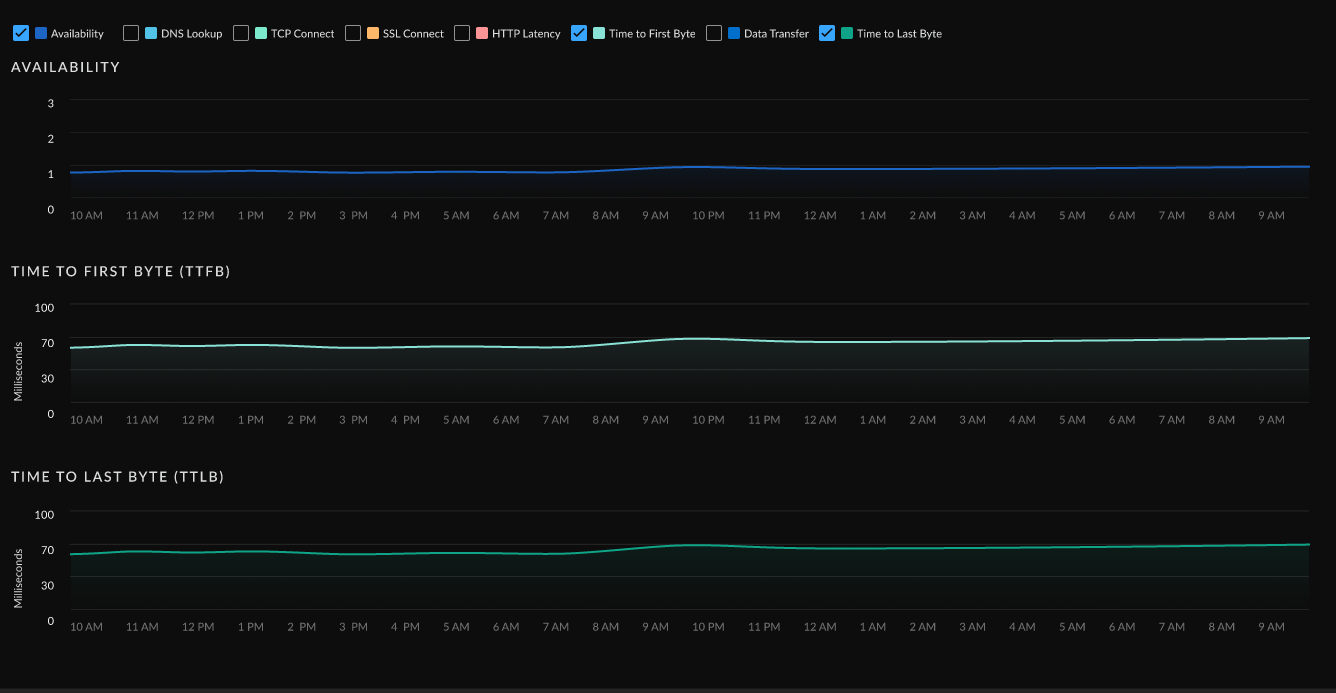
| Metric | Description |
|---|---|
| Availability | Application availability (in percentage) during the Time Range. |
| DNS Lookup | DNS resolution time. |
| TCP Connect | Time taken to establish a TCP connection. |
| SSL Connect | Time taken to establish an SSL connection. |
| HTTP Latency | Time taken to establish an HTTP connection. |
| Time to First Byte | The total of DNS Lookup, TCP Connect, SSL Connect and HTTP Latency time results in the Time to First Byte. |
| Data Transfer | Total time taken for the entire data to be transferred. |
| Time to Last Byte | Time to First Byte + Data Transfer time. |
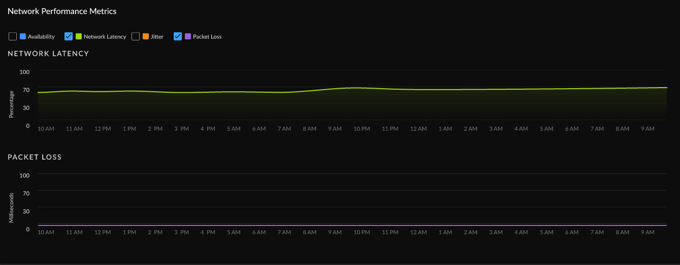
| Metric | Description |
|---|---|
| Availability | Network availability metrics during the Time Range. |
| Network Latency | Time taken to transfer the data over the network. |
| Packet Loss | Loss of packets during data transmission. |
| Jitter | Change in latency during the Time Range. |
Real User Performance Metrics (Requires Browser-Based Real User Monitoring (RUM))
View trends for real user monitoring metrics over your configured time
range. You can use this information to find out whether application performance
is causing degraded experience for your users and to rule out other causes.

| Availability | Whether applications are reachable. |
| Page Load Time | The average time that a webpage takes to load. |
| Time To First Byte (TTTB) | The time it takes from when a user makes a request to a website until the browser receives the first byte of data. It measures how quickly the server responds to a request. |
| Largest Contentful Paint (LCP) | Reports the time it takes to render the largest image or block of text in the visible area of the web page when the user navigates to the page. |
| Cumulative Layout Shift (CLS) | Measures how stable the content of your webpage is as a user views it. The metric considers the unforeseen movement of elements within the visible area of the webpage during the loading process. |
| First Input Delay (FID) | Monitors the duration between a visitor's initial interaction with a web page and the moment the browser recognizes and begins processing the interaction. |
| Interaction to Next Paint (INP) | Monitors the delay of all user interactions with the page and provides a single value representing the maximum delay experienced by most interactions. A low INP indicates that the page consistently responded quickly to most user interactions. |
Application Domains
Application Domains gives you a centralized view of
the app domains that ADEM is monitoring. This view gives you the
following insights into your application domains:
- Mobile User and Remote Site Experience score for the domains across your organization.
- A list of all monitored app domains with information about
- Monitoring sources
- Synthetic test configuration (if available)
- Real user monitoring details (if available)
Mobile User Experience Score
Shows the number of domains user devices have accessed and its experience score
distribution. Uses RUM data if available for a domain. If not, it uses data from
application tests, if configured. If both are available, the scores consider RUM
only.
You can select the number of application domains in each ranking to apply a
filter to the Application Domains table.

Remote Site Experience Score
Shows the distribution of experience score for the domains that ADEM is monitoring from your remote sites. You can select the
number of application domains in each ranking to apply a filter to the
Application Domains table.

Application Domains Table
Shows details about the domains that ADEM is monitoring in
your environment. You can use this table to sort, filter, and
Search your application domains to identify any that
are problematic and begin further investigation.

| Application Domain URL | The URL of the application domain. |
| Monitored Application Suite | If applicable, the name of the app suite to which the domain belongs. |
| Synthetic Application Test | If configured, the name of the application test configured for the domain. If no application test is configured, displays the option to + Enable Application Test. |
| Pages | (Requires Browser-Based Real User Monitoring (RUM)) The number of pages on the domain that a monitored user visited. |
| User Experience Score | The experience score for users on the domain over the configured time range. |
| Site Experience Score | (Synthetics Only) The experience score for the remote site to the domain over the configured time range, as reported by application tests. |
| Synthetics / RUM |
The sources that ADEM is using to monitor the domain.
|
| Synthetic Test Status | Whether an application test is Enabled or Disabled for the domain. |
| Priority | The order in which the application test was created and in which the test is run. The first application test created is assigned a priority of 1, the second test a priority of 2, and so on. The priority of a test determines the order in which ADEM runs the test. |
| Users - Synthetic Tests Enabled | The number of monitored user devices that are running periodic synthetic tests for this domain. |
| Users - Generating RUM | The number of unique users with the RUM browser extension installed and visiting web pages on the domain. |
| Sites - Synthetic Tests | The number of remote sites that are running synthetic tests for this domain |
| Application ID | A system generated ID that uniquely identifies an application domain. |
| Usage Source |
The type of ADEM Agent providing this information:
|


