Autonomous DEM
Zoom Performance Analysis for an Application
Table of Contents
Expand All
|
Collapse All
Autonomous DEM Docs
-
-
- AI-Powered ADEM
- Autonomous DEM for China
-
-
Zoom Performance Analysis for an Application
The Zoom Performance Analysis button is displayed only if you have
purchased the QSS add on from Zoom and enabled it on ADEM. When you open the
Application Details page by selecting the Zoom application in
the Applications dashboard, the Zoom Performance
Analysis is selected by default. The data shown here pertains to the
Zoom app across the entire organization and aggregates call performance and root cause
data across all users in the organization.
Zoom User Experience Summary
This widget displays the aggregate Zoom app experience for all users across the
organization. It gives you a bird's eye view of the total number of Zoom meetings
attended by all users in the organization during the Time
Range and the sum of all the meetings' duration in minutes along
with the percentage of meetings/minutes that did not have any issues. It tells you
what percentage of users who used Zoom were also registered with ADEM.

Zoom Poor Performance Root Causes
This widget breaks down and categorizes the root cause of poor performance. The
reason for poor call performance can lie in any segment such as the user's device,
the local network the device is connected to, internet performance, or the WiFi.
Here, you can see every minute of poor call performance graphed by the most likely
root-cause and broken down by service delivery segment. Hover over a root cause in
any segment as shown below to see more details about it.

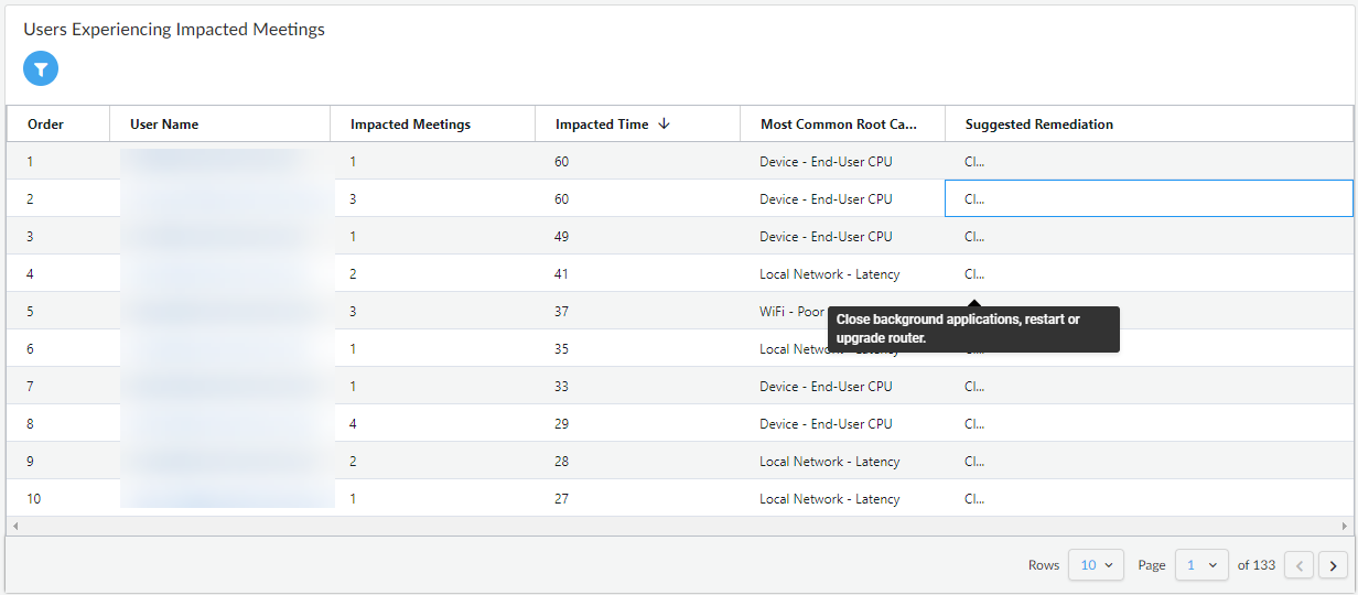
Users Experiencing Impacted Meetings
View a list of all the users who were impacted by any Zoom meeting that they attended
throughout the organization. Click a User Name to go to the
user's User Details page. You can filter the data in this
table by selecting a filter from
![]() . You can filter for the users who have the most minutes impacted by a particular
root cause by selecting Root Causes from the filter.
. You can filter for the users who have the most minutes impacted by a particular
root cause by selecting Root Causes from the filter.

Global Distribution of Impacted Users
The map in this widget shows you how many Zoom users are connected in each Prisma
Access Location. The circle representing each location is color coded to give you an
overview of the average of all users' experience in that Location. The map makes it
quick to identify regional issues like ISP outages. Hover over a circle to see the
number of Mobile Users connected in the geographic location separated by their
experience scores. Clicking on the number of users takes you to the
Monitored Mobile Users page where the
Monitored Mobile User Devices table displays the details
for each user in that location.

